This is the story of a guy and a large company. It seems whenever this company puts out products, said guy has to poke at least some fun at them. But come on, you know they ask for it. Maybe you’ll see what he sees in this one.
So you’re going see a lot of posts today about Google’s new browser, Chrome. Apparently it’s not finished, and if you’re viewing this site in it, I suggest you don’t, since it appears that they’ve exchanged text-shadow for text-shitify.
But we’re not going to talk about that. No, you’re not going to hear me go off about how it doesn’t fit with the OS or how it fails at rendering rounded corners. No, we’re going to talk about something much more substantial in the sprit of talking about Google on Avalonstar. Exhibit A please.
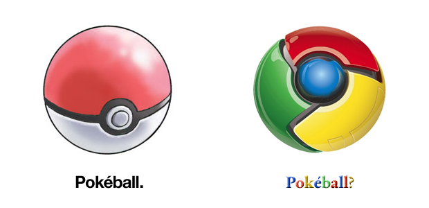
Discuss.

Chrome, I choose you!
Yeah, that could work ;)
I think the Lure Ball is a pretty close match. Can’t wait to implement text-shitify later this evening.
This logo is obviously a hint towards a future announcement of partnership between Nintendo and Google to build a strategy game modeled after Pokémon that will instead help with testing the Chrome browser’s rendering engine.
If that’s not the case, then I’m completely lost.
In my opinion I think the logo is closer to Samus Aran (Metroid) in her Morph ball form…eerily similar.
I agree! That was one of my first thought. Great minds think alike ;) Or maybe just nerds…
I just want to know what’s contained in those two little compartments on the lower right side…
Avalonstar looks 100 types better in IE that Google Chrome. The typography looks really horrible in GC.
Nah, you guys have got it all wrong. It looks like Simon! http://images.google.com/images?q=Simon+game
Definately Simon haha!
It seems GC may also have issues with alpha transparent PNG images with the opacity rule as well. BTW, this GC logo looks too shiny and like something my 2 year old will play with. I don’t dig it.