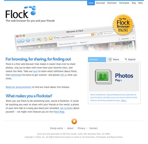
Flock Gets a Makeover
Since Friday, June 2nd, I've been working on an awesome project with the great team at Flock. What started as a trip to go visit my good friend Will Pate turned into the opportunity of a lifetime. I had the chance to take a creative role in how Flock, who are trying to revolutionize the way youth browse the web, presented themselves. Needless to say, I jumped at the opportunity. However, it wasn't all sweet. By taking the project of providing them with an effective redesign to accompany their new beta product, I threw a gigantic rock in their way. In fact, they were close to finishing a redesign headed by another great designer. As I was sitting and watching the tour of what they had, I felt that it didn't effectively reflect what they were. Needless to say, I gave myself all of this work, driven by the feeling that I could really do something better.
So without further ado, I present to you Flock's new website, the first major project to come out of my new company.
Cannibalism
This was the theme of this design, at least in my mind. My personal problem with the previous iteration of the design was the fact that it didn't utilize many of Flock's defining features - the browser itself, the light shades of blue and especially their famous star. So I started with a clean canvas and started with a few swatches of blue pulled from the logo. A lot of my inspiration for the coloring came from Flock's original website, created by Chris Messina. I also loved the simplicity of that site, but as usual wanted to add my own personal touch to it. The first iteration did have some great concepts, such as the rounded navigation and half-height headers for the inside pages. But that still left the homepage. As you can see, there's not much text there, so we needed to communicate what Flock was via Bart's "5-second-rule". What better way to do that then to display the browser itself? So that's what I did.
A lot of the site was already finished when I came in, I just had to apply the new color scheme. It was also my first chance to play with Drupal. Unfortunately, although it's a very powerful CMS, I didn't have the greatest time with it as it came to be one of the most cumbersome and roundabout pieces of software I've ever worked with. Maybe, I'm just too used to how WordPress works. But if you're looking at applying a theme to a Drupal installation, remember that there's quite a learning curve when trying to conquer those quirky nodes and blocks.
There's not much more than that when it comes to the site. Now I have to thank a few people.
Thanks and Acknowledgements
I'd like to thank more than just the great people at Flock (Bart, Geoffrey, Brian, Will, Daryl, Jesse et al) for this opportunity, but also Matt Downey of 45royale. Matt had been part of both redesigns, and I was thankful from the beginning that he was a part of it. He was very accommodating of the change of designers and adapted very well. Nevertheless, Matt does some awesome work. The Flash widget on the homepage was designed by myself but was brought to light by Jeremy Britton of Zurb. I'd finally like to thank Brian Bell of Joyent for not kicking my ass when I took over the project (actually, I heard he was happy to give it to me since he was doing about 1,000 things at once). I also have to thank him for the beautiful icons which I seemed to plaster all over the new design. He really had a hand in Flock's new identity. :)
This was an awesome project, and having Flock as a client is a great start for the new firm (which will be formally announced in the next few weeks). I've had a lot of fun, and it was great to get the feeling that accompanies working on your own. Now, if you haven't taken a look at the site, please do so - and remember - Bryan headed the creative direction. This means, coming to me wining that it's not standards compliant will win you a one way trip straight to the guillotine.

