You look tired.
About two weeks ago, I kicked myself in the ass and gave myself a challenge. While Dan finished in a mere four days, it’s taken me a little longer to do. A fair number of people asked me how it felt to actually expose myself like this, and I have to say it’s been a mixed pot of emotions. There were times where I seriously wanted to just throw up a coming soon sign, or the old Aries Project design. On the other hand, I am really enjoying the constant feedback I’ve been getting whenever I, for example, move text around. People have also been able to see how I like to work in spurts and exactly when those times have come and gone.
So I’m going to take the time to talk about the first stage of this redesign.
From the beginning shall we?
Time for the mentality part, because I never really explained the why of this redesign. Thoughts of the eminent 23rd version of Avalonstar began at about the same time I began Revyver, so about a month after last May’s CSS Reboot. I saw the first version of the Aries Project as an experiment in changing the way people interacted with Avalonstar while also putting my categories at the forefront. In theory, it was an awesome experiment and it expanded my PHP knowledge. But there were a lot of problems with it. People started having trouble with cookies, individuals were complaining about contrast, there were a lot of elements missing (such as headers from the post pages that I never got to), and nobody really knew which post in my listing was the newest one (if they suffered from said cookie problem).
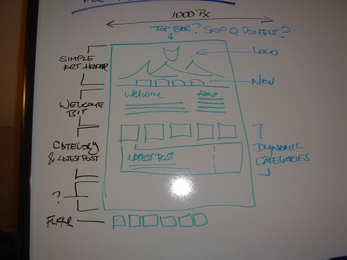
Even with the warm reception that version 22 received, there were an equal number of small but valid complaints. As those numbers grew, I started to “eat my own dog food” and the taste started to grow sour. I didn’t even like browsing my own site. So that was the last straw and I began to think of what I could improve. On June 9th I started doing something that I had never done for a version of Avalonstar — wireframe it. Or in my mind, “I have a whiteboard, I’m holding a marker, I should draw something.” For the longest time, that’s what version 23 existed as, a wireframe. I had no design in mind for it; not even a clue. What I did continue to do was rework the drawing, periodically erasing it all to see if what was in my mind still reflected what I had drawn previously. Sure enough, the drawing behind me marked in orange now reflects what it was in the picture I just showed you.
Moving on from wireframes.
As a lot of you already know, Avalonstar started out as a personal portfolio and a stage for some random articles. It then evolved into what many of you first saw it as, a blog obsessed with design and eggrolls. Now, it’s starting to become more than just a blog, taking a step forward and a step back to where it used to be. My mindset is such that I like to keep assets in a certain place. As my involvement in different areas grew, so did the magnitude of sites that sprouted around Avalonstar - the store, the bowling, the forums, the podcast, Revyver, et cetera. They all shared a similar origin, but nothing really tied them together. One of the underlying reasons behind the redesign would be to sort of tie everything back together under “one banner” per se. As this new design evolves, you’ll begin to see things like that on the front page - much like my Featurettes of version 21.
Now, some talk about progression.
For those of you just joining the fun, let me catch you up on what’s been going on over the last 13 days. I started fresh using Scott and Andy’s Sandbox theme. I’ll have an entry in the future going over my reasons why Sandbox should be WordPress’ new default theme. In a few words: it is the most powerful theme there in terms of styling, and it has hAtom support. I was actually really happy to see that the people who followed suit in this design experiment also chose Sandbox as their theme of choice.
First, I wanted to see how far I could go without touching any of the markup, and I focused on that for the first few days. Since I didn’t want to completely ruin Sandbox’s hAtom support (which I think I still manged to do), I decided that I would try to just hide portions of content that I didn’t want to display. Take a look for yourself, if you look at the source of the front page, you’ll see that the last 12 entries will be there in their entirety. A few different arguments popped up in my head afterwards, concerning loading time and other factors, but I have yet to make a final decision on it. Who knows, I could probably slap in some milk to make them viewable through the front page (or at least the excerpt).
As a note, I actually kept a lot of Sandbox’s styles until just yesterday when I ran into a cascade problem that led me to just axe the crutch that I had used through the first part of the redesign. Why did I have the crutch? Well, as Chris J. Davis said in a comment, the site should still be readable while I wad designing, so I honored that.
That first few days had a lot of focus placed on the post page. To be honest, when I was working on early mocks for this version back in July, I had only managed to finish one for the a pseduo-grid version. Also, I had actually went ahead and coded it up for fun while I still worked off my development section. All I really had to do was just adapt the CSS to the new markup (again, I wasn’t trying to touch as little markup as possible). After I had discovered the wonders of position: relative and position: absolute, I made sure to use a lot of that on the post page. All of the headers are absolutely positioned and right aligned relative to the paragraph that they are placed before. This seems to work in all cases except when a <blockquote> follows a header element, it just looks really bad. I had some fun with placing images in this fashion, a few examples being shown in this post. This is flexibility I didn’t have within the content area of the last version. As for <blockquote>’s, I’m still deciding on the best way to display those.
Once I felt happy with that layout, I started to half-ass the front page.
One of my peeves with the last version that developed after a while was the fact that I had about 3 or 4 ways to display posts and the categories that contained those posts, depending on which home page you got. I wanted to fix that and the widget you now see on the front page was one of the first I had worked on; I just never decided it if it looked better horizontal or vertical. Obviously, I finally decided on a horizontal display after playing around with it a little, adorning it with a little highlight based on the latest post. The code is pretty messy, but I’ll show it to you guys anyway:
<ul id="cat-intro" class="naughtyfloats">
<?php for ( $counter = 1; $counter < 7; $counter++ ) {
    $newest_post = $wpdb->get_var("SELECT ID FROM $wpdb->posts WHERE post_status = 'publish' ORDER BY post_date_gmt DESC LIMIT 1");
    query_posts("showposts=1&cat=$counter");
    while (have_posts()) { the_post();
    $short_title = smart_trim(the_title('', '', false), 25, false);
    ?><li class="<?php echo 'cat'. $counter;?>< ?php if ( $newest_post == $post->ID ) { echo ' latest'; } ?>< ?php if ( $counter == 6 ) { echo ' last'; } ?>">
    <?php if ( $newest_post == $post->ID ) { ?>
    <h3><?php foreach((get_the_category()) as $cat) { echo '<a href="http://avalonstar.com/category/' . $cat->category_nicename .'" title="Go to the main page for ' . $cat->cat_name . '">' . $cat->cat_name . ''; } ?></h3>
    <h4>My Latest Post</h4>
    <?php } else { ?>
    <h3><?php foreach((get_the_category()) as $cat) { echo '<a href="http://avalonstar.com/category/' . $cat->category_nicename .'" title="Go to the main page for ' . $cat->cat_name . '">' . $cat->cat_name . ''; } ?></h3>
    <h4><a href="<?php the_permalink(); ?>"><?php echo $short_title; ?></a></h4>
    <h5><?php the_time('F jS, Y'); ?></h5>
</li><?php } } } ?>
</ul><!-- #cat-intro -->
After putting doing some dirty styling below this category widget, I moved on to actually giving it a bit more life (or not, depending on how you see things).
But… you went dark again.
Yea, knew this would come up. Avalonstar went dark again as you can see as that was my next step in the process. To be honest, I’ve enjoyed Avalonstar dark and every time I stepped in the shower (my place of inspiration) I haven’t envisioned it in any other fashion. So sorry to those people who wished for a lighter version, maybe I’ll just build a stylesheet with the colors inverted. Yet, if I were to force myself to go light, one, I wouldn’t be my best effort and two, it wouldn’t feel like it was mine. So with that being said, I started adding more graphical elements to the page. More graphical elements being the Phoenix shield, the masthead placeholder (which will soon carry some artwork inside) and one new addition.
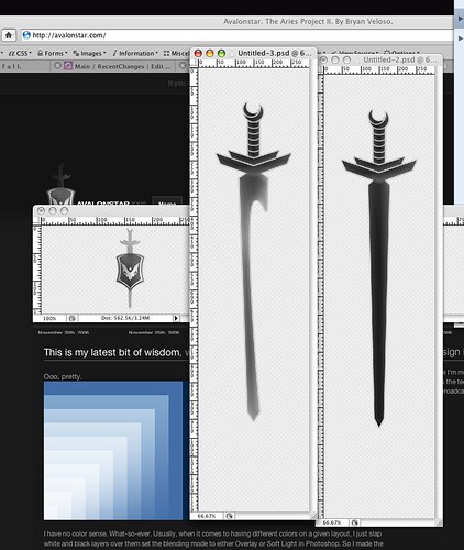
I’ve always wanted to create a sword when I created the Phoenix shield, but I never got the chance to try it out. Since I was planning to take a different route, I thought, why the hell not? So I took about half-a-day looking at swords on Google Images. After failing to find a sword that looked decent enough in my eyes, I pulled out my Final Fantasy XII strategy guide and looked there. So what you see behind the shield is a sword inspired by Final Fantasy XII. At the moment it’s not going to be a permanent part of the logo; it’s just sort of there to prevent the shield from feeling lonely.
As you can see from the screenshot, I pretty much whored the blending mode tools to get something that looks like a sword with highlights. Thankfully, that ultimately didn’t matter when I placed it on the header. That image is a transparent PNG (cue gasp), because I want future masthead images to show through that part. Actually, I’ve become quite fond of transparent PNGs after working with the new Live From the 101 (which I actually never officially announced).
Finally, the navigation is what I took a whack at last night. It is actually a modified version of the code I’m using in the soon to be released 3rd version of Nyxsis’ identity, which will debuting very soon.
So what’s the next 50% like?
So as made obvious by the title, I’m at about the halfway mark of this design process. I only say that there’s more than 50% to go because, we’ll there’s all the content and then the porting of this design to the store and the forum for example. Mostly what you’ll see over the next few weeks is a lot of polishing, as I start to add content, a real colophon (probably linking to this post and the final one) and connect all rest of my sites to this one. Hell, I might even add a bit more color.
As you know, these things come to me in spurts, so who knows when you’ll wake up one morning to a completely different look. Well, not exactly, but you get the point. For example, I wanted to add a caption to that hideously long image up there, so I added styling to that.
I have to say that if I had to do this all over again, I wouldn’t. It was a challenge and an equally great feeling to go through this process. I’m really loving the feedback I’m getting, whether it’s good or constructive while inviting people to see how I design. I’ve tried my best to go over as much as I possibly could about the process, but feel free to ask questions if you have any.