Change and Withdrawal
(I'm going to keep this short. I'm fading quickly. :D)
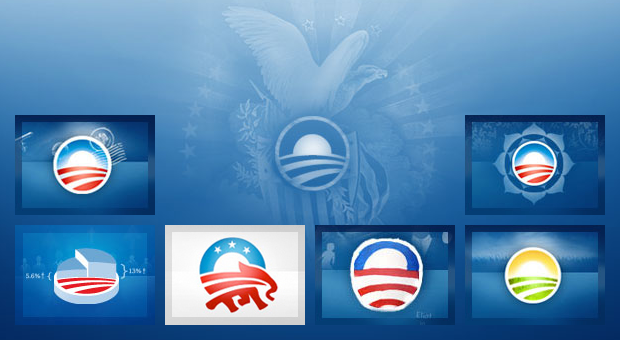
After 21 months, the people have spoken, the person I wanted for President of the Untied States has been elected. I'm clearly ecstatic. However, as a designer, I can't help but feel a bit empty. If President-Elect Obama has done nothing else, his campaign has inspired countless designers, you and I alike. He has run one of the most beautiful campaigns in our country's history with one of the strongest identities of any candidate in history.
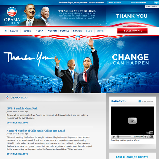
Every site that has come out of the Obama campaign has been beautiful, from the main campaign site shown below to the "Fight the Smears" campaign. The level of detail and the amount of thought put into this has boggled my mind. Maybe my mind is easy to impress, but I'm sure most designers would tend to agree with me. :)
[ ][1]
][1]
At least that's what I think.
I will miss this. Wether or not you voted for Obama, the superiority of this identity will stand for years to come. I for one, really hope that the design team migrates to Washington and redesigns it. Start with the White House, then move on to say, the FBI and the FCC and beyond, they desperately need it. :)
Anyway, to those designers, you have my thanks and the thanks of designers all over the world.
[1]: http://www.flickr.com/photos/avalonstar/3004177859/ "The "O" by Bryan Veloso, on Flickr"

