The last six weeks have been a roller-coaster ride, things have gone from up to down and up again and the path ahead of us is a lot brighter and a lot clearer than it has ever been. One of the reasons for that falls around a “studio incubator for social media enterprises and engines of engagement” that goes by the name of SpectrumDNA and their pet project, the Addictionary.
I felt a resonance and a chance to help a company who has had the worst luck with UI in the past when their COO, Kelly McCrystal, contacted me even though it was a few days after I had closed down that part of Revyver. “I didn’t care, I sent it anyway,” she said to me a few days ago in retrospect.
The Addictionary was a challenging project as was the process of finishing it. So rather than describe my mental state (and unintentionally skipping over the process) as I usually seem to do, I’m going to try and hit some of the highlights and downfalls that occurred over the past six weeks.
So what is the Addictionary?
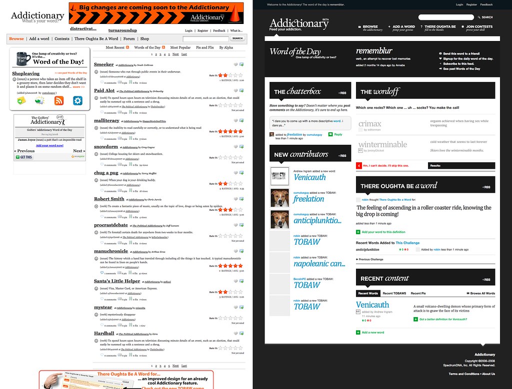
To start, a few words about what the Addictionary is. The first product one would compare it to is the Urban Dictionary. They’re both social dictionaries with words submitted by users. The difference lies in the execution of the model. While Urban operates in a horizontal structure, being all things to all people and forever owned by the creators (or the companies who eventually buy them), the Addictionary is a platform or engine network, as CEO Jim Banister puts it, focused on vertical markets. These engines are then licensed out or sold for companies to include in their product offerings. A big example would be the Political Addictionary which is licensed by Comedy Central for their Indecision 08 campaign.
From a business standpoint, it’s a great model. Definitely something that you don’t see in the era of “me-too”s.
Another project, another challenge.
No matter what Spectrum did with the platform afterwards, my focus was on Addictionary proper. When I saw the site for the first time, my eyes cried without my brain having to tell them to. There was no continuity, no identity, nothing to pull it together. The first thought that came to mind was the fact that I couldn’t make this site graphically intensive. It was a dictionary, so the words and the typography around those words had to take precedence. Deciding that early on made my job that much harder, more mentally than anything else.
Now herein lies the problem. I don’t consider myself to have a great grasp at the fundementals of typography. The fact that I was drawn to Helvetica all the time didn’t help much either. If I was going to even come close to getting this right, then I had to do my research. I didn’t have to look far, with Jon Boardley’s iLoveTypography articles and Dan Rubin’s typography relapse. That certainly isn’t an all-inclusive list by any means, as visits to places like Dictionary.com and the New York Magazine were frequent.
However, it was Dan that confided in to find the star of the show. He did just that.
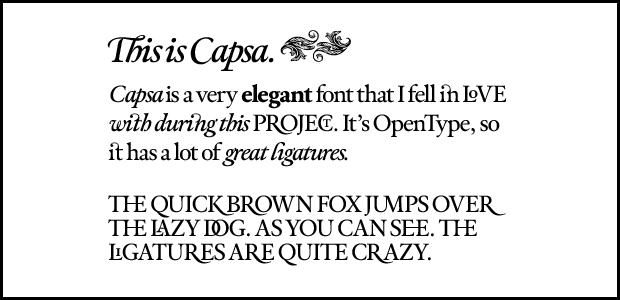
The type stars. Capsa, Gotham and… Cambria.
The old Addictionary logo was “set” in Georgia, with no kerning of any kind. Georgia with kerning might have worked, but that wasn’t the look I wanted for them. They needed something that said, “you could put me in a book if you wanted to and it’d still work!” After about a day of looking, Dan came back to me with Capsa from TypeTrust. Capsa is a beautiful face that the guys at Spectrum automatically fell in love with. Capsa was also my introduction into what OpenType can really do. So much so that I want any font I purchase in the future to have the same type of flexibility. Seeing how many combinations you can make is also a great time waster.
Capsa’s co-star was my recently formed addiction, Gotham. My reasoning for this extends no farther than, “it’s beautiful and it just worked.” If anybody tries to cite the political undertones or mention that the use of this particular font is a fad, I’ll punch them in the face. Really now, if I needed a reason for all of my decisions, I’d probably be a corporate asshat by now. I shall now place Gotham alongside Helvetica Neue in my “overused, but I don’t give a crap,” box.
Finally, I needed body type. Most people would see Georgia. But what’s weird about this is the fact that for the first time Vista users would be able to receive an “intended” part of the design this part being the Vista-only (unless you download it yourself) font, Cambria. The only time I had used a Vista-only font as the first choice in the past was back when the first version of Revyver was designed using Calibri.
Hello monochrome.
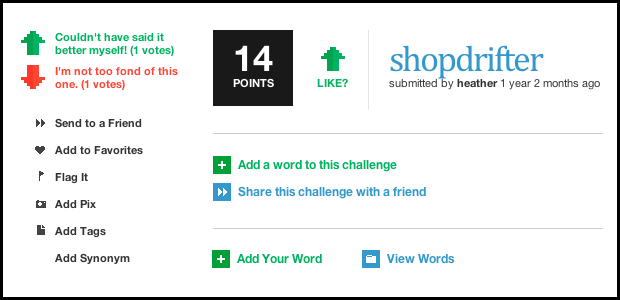
To preface, I have to admit I’m kicking myself for making it so monochrome. Part of the reason that it ended up monochrome was the fact that I didn’t have enough time to go any further with it, the other part I’ll address below. However, it worked out as Spectrum liked the feel of it. Actually, I was so wrapped up in trying to make the typography work that I completely forgot about throwing any colors in, despite what I just said. Monochrome did allow me to use color selectively. I was able to form different paradigms for different functions around the site. A green arrow and a red arrow would always prompt the user to vote, for example. A green box, no matter what Chameleon icon (and there were a lot of those) was inside would signify an “add” action. Blue would signify an action that doesn’t add anything to the site, but rather carries them to another part of it, etc. This was honestly a product of laziness, but it was quite effective when the group started to test it.
The layout itself was once again created using 960.gs. While I always find myself using the Photoshop templates, I only used the system’s markup in the header and footer, since those would never change no matter what “silo,” a so-called child site of the Addictionary would be. This would allow partners to rearrange the site without having to touch the markup. Granted, I only noticed this after I coded the site the first time causing me to go back and do it all over again.
We don’t need no stinkin’ Trac.
This is more of an aside, but I was quite intrigued by the way Spectrum handled the final days before the launch. Since nearly technical person in the room (besides Jen and myself) was from the enterprise sector, it was interesting to watch them. It was their first time performing tasks that we take for granted; tasks that are a part of the agile development movement. They had done their homework too by inviting different leaders of the agile thinking world to Park City to educate the team.
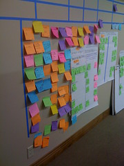
Facebook and Automattic were inherently “agile.” So to think of development any other way was foreign to me. Spectrum did an awesome job, even with the environment and timeframe being less than ideal. The most interesting part of the process to me was how low-tech their issue management system was. Even though they had Crucible and Jira, which would be the equivalent of say GitHub and Lighthouse or Sifter respectively, minus the code reviewing features. They threw that all away and used—sticky notes. The funniest thing is that the sticky notes were surprisingly effective. While closing tickets in Trac is a great feeling, running from your computer chair to the validation wall and slamming said ticket onto said wall is an even greater feeling that never failed to put a smile on my face. Granted, the environment was right. Everybody working on the launch was in-house, so sticky notes took less time to write and triage.
 https://farm4.static.flickr.com/3170/2771710892_720682120a_m.jpg
IE6 gets its revenge.
This needs no introduction and I wish I could condemn this browser to the fiery pits of hell. But karma’s a bitch and it came back to kick my ass in the end. I’ve been working with IE6 for a long time, like many of us had, but if IE6 were to ever make a final stand against me, it did so this past week. The odd thing is, it wasn’t CSS related at all. It was with a problem that I could not find documented at all. After intense research the only post I had found was published this year.
I designed Addictionary with transparent PNGs, mainly to assist in future theming of the site for partners. Everything went well at first. We found a transparent PNG fix for IE6 which worked like a charm other than ruining the positioning of the fixed elements. This continued for about a 24-hour period. However, once the project started entering its final moments, IE6 decided to have a hissy fit. It suddenly didn’t want to load and we thought, at first, it was because of the transparent PNGs.
The article I found backed this claim, citing it was DirectX accompanied by IEs two-connection limit. So, I tried their solution first, changing all of the PNG24 images into PNG8. That didn’t work because the index transparency in IE6 made all the graphics look like complete crap. So I took out the transparency in the PNG8’s and tried again, it still didn’t work. This boggled me, IE never hung on regular PNGs as far as I remembered, but IE6 still refused to load. It wasn’t until I had converted all the images to GIFs that we started to see the site. vBulletin, which runs their authorization system, oddly, was letting people upload PNGs and those were choking IE6. So after banning all PNGs from the site in the 25th hour did IE6 finally let us in.
Needless to say, the entire company wants to drop IE6 support for all future products and for Addictionary once IE8 comes out.
Afterword.
Would I call this my best design? No. But am I ever really happy? No. Did Dan Cederholm’s icons help? Immensely. Will I be going to Dan Rubin for more font advice? Definitely. Will I have the urge to polish this site? The moment they drop IE6.
Beside the browser problems and the compressed timeline, I’m delighted with what I was able to focus on. I had the chance to not force, but fit a typography based design into a project. I spent more time making sure my baselines grids worked (in Safari at least) than on any other project I’ve done so far. I’ve never had so much fun playing with OpenType, and I hope to find even more awesome fonts like Capsa in the future.
Although I closed Revyver’s doors to the client world, something about the guys at SpectrumDNA spurred me to make an exception. Maybe it’s fate, maybe it’s something else. But things are looking up, and you’ll see why soon enough.