Suit&tie
A few months ago, word found its way to me that Adriaan Pienaar was looking for me to create a theme for his premium WordPress theme shop, WooThemes. To make a potentially long story short, it wasn't until a few weeks ago that our paths finally aligned and I felt I was ready to take on the project.
Adii gave me the task of creating a business-style theme, which was a bit of a surprise since, to be honest, it took me a little bit of time to wrap my head around creating a "business-style" theme for a piece of "blogging software." Granted we could get into an argument about that fact but the bottom line was that I had to steer my mind away from that line of thinking in order to comfortably progress.
He took a look at my portfolio and pointed to the design I did for Django Plugables as something that would make a good candidate for the theme. I didn't mind since *cough* that design is on its way out anyway *cough* and I welcomed the chance to remix it a little. Remember, I designed the site in a day and coded it in four, so I didn't really put as much thought into it as I normally would. It just worked. :)
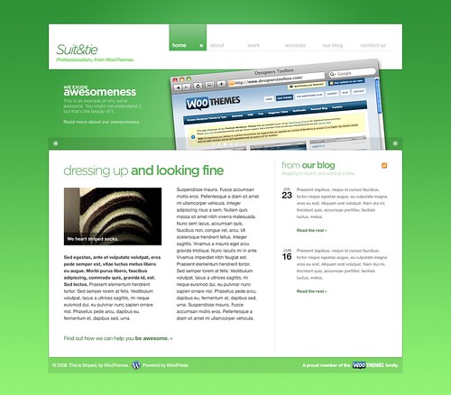
So here's "Suit&tie."
More and more lately I've been a lot more open to using touches of translucency in designs. As always, I lean on more colorful assets such as photos and screenshots to provide the "pop" for the design. The jQuery carousel in the middle is obviously inspired from the Springboard on the iPhone (and I can't wait to actually see that effect coded). Although I designed this from scratch without the Django Plugables design to work from, you can obviously see the elements I pulled from it--examples being the navigation and the content area.
Why the striped sock? Well, the theme was originally called "Suit&tie" until I started playing with some stripes and the obvious name of "Striped" took over (you can still see that name on the screenshots in the footer, whoops). The stripes ultimately didn't make the cut, but the sock is there to mourn it.
Working with Adii and the WooThemes team was an absolute pleasure. The amount of breathing room I was given was very welcome and they provided just enough guidance throughout the process to provide that extra bit of refinement. Now I leave the theme in their able hands as it will surely see the light of day in the coming months. The initial reaction has been awesome so far and I hope that people will enjoy it when it does get released.


